How to Style Gravity Forms Radio Buttons: A Complete Guide
Gravity Forms is a highly popular WordPress form builder plugin that allows you to create flexible and powerful forms for your website. One of the most common elements in these forms is the radio button—used for selecting one option from a list. While Gravity Forms radio buttons work well out-of-the-box, you might want to customize their appearance to better fit your website’s branding and design.
In this article, we’ll walk you through how to style Gravity Forms radio buttons using custom CSS. From changing colors and sizes to adding hover effects, this guide will help you take control of your form’s visual elements, ensuring your forms are both functional and visually appealing.
Why Customize Gravity Forms Radio Buttons?
Customizing radio buttons in Gravity Forms offers several benefits:
- Brand consistency: A custom-styled form that matches your website’s color palette and typography ensures consistency across all touchpoints.
- Improved user experience: Clear and engaging design makes it easier for users to interact with your forms.
- Accessibility: Customizing radio buttons for larger size or higher contrast improves accessibility for users with disabilities or those using mobile devices.
Let’s dive into the step-by-step process of styling your Gravity Forms radio buttons using CSS.
Step 1: Target the Radio Button Fields Using CSS
Before customizing the radio buttons, you need to know how to target them using CSS. Gravity Forms assigns specific class names to each form field type, including radio buttons.
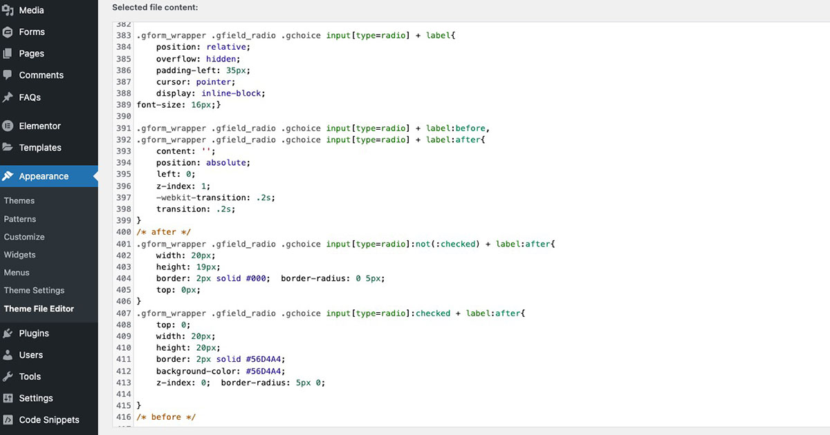
Our Standard CSS for Gravity Forms Radio Button Field:
display: none;}
.gform_wrapper .gfield_radio .gchoice input[type=radio] + label {
position: relative;
overflow: hidden;
padding-left: 35px;
cursor: pointer;
display: inline-block;
font-size: 16px;}
.gform_wrapper .gfield_radio .gchoice input[type=radio] + label:before,
.gform_wrapper .gfield_radio .gchoice input[type=radio] + label:after {
content: ”;
position: absolute;
left: 0;
z-index: 1;
-webkit-transition: .2s;
transition: .2s;}
/* after */
.gform_wrapper .gfield_radio .gchoice input[type=radio]:not(:checked) + label:after {
width: 20px;
height: 19px;
border: 2px solid #000; border-radius: 0 5px;
top: 0px;}
.gform_wrapper .gfield_radio .gchoice input[type=radio]:checked + label:after {
top: 0;
width: 20px;
height: 20px;
border: 2px solid #56D4A4;
background-color: #56D4A4;
z-index: 0; border-radius: 5px 0;}
/* before */
.gform_wrapper .gfield_radio .gchoice input[type=radio]:checked + label:before {
left: 1px;
width: 8px;
height: 16px;
border-top: 2px solid transparent;
border-left: 2px solid transparent;
border-right: 3px solid #000;
border-bottom: 3px solid #000;
-webkit-transform: rotateZ(37deg);
transform: rotateZ(37deg);
-webkit-transform-origin: 100% 100%;
transform-origin: 100% 100%;}
.gform_wrapper.gravity-theme .gfield_radio label {
line-height: 1.4;}
This selector targets the radio button elements inside your Gravity Forms. You can apply your styles to this class to customize their appearance.
Where to Add the CSS:
You can add the custom CSS in the following areas of your WordPress website:
- WordPress Customizer: Go to Appearance > Customize > Additional CSS.
- Theme Stylesheet: Edit the
style.cssfile of your theme (or child theme). - Custom CSS Plugin: If you prefer not to edit theme files, you can use a plugin like Simple Custom CSS to add your styles.
Step 2: Test Your Radio Button Styling
After adding your custom CSS, it’s essential to test the styling across different browsers and devices to ensure consistency. Check how the radio buttons display on both desktop and mobile, and ensure that the custom styles are responsive.
To check responsiveness:
- Use the WordPress Customizer to preview how the radio buttons look on mobile and tablet.
- Test your form in different browsers like Chrome, Safari, Firefox, and Edge to ensure the customizations work across platforms.
Conclusion
Customizing the Gravity Forms radio buttons with CSS can significantly improve the appearance of your forms, making them more user-friendly, accessible, and aligned with your website’s design. From changing the color and size to adding custom hover effects and inner icons, the steps in this guide give you everything you need to create professional, branded forms.
At Masthead Technology, we specialize in customizing Gravity Forms for businesses looking to improve both form functionality and design. If you need help styling your Gravity Forms or want to explore more advanced customization options, feel free to contact us for expert support.
For more information on styling Gravity Forms, see our posts on How to Style Gravity Forms Submit Button and How to Style Gravity Forms Checkbox.
FAQs
1. Can I style Gravity Forms radio buttons without CSS?
While Gravity Forms offers some built-in styling options, advanced customizations like changing colors or adding hover effects require CSS.
2. Will my radio button styles work across all browsers?
Yes, as long as you test your custom CSS thoroughly, your styles should work across major browsers (Chrome, Firefox, Safari, Edge). Always check for browser compatibility after making changes.
3. Can I target specific radio buttons in Gravity Forms?
Yes, you can target specific radio buttons by their form field ID. For example, .gform_wrapper #field_1_1 input[type="radio"] will only style the radio buttons in the form field with the ID 1_1.
4. How can I make my radio buttons responsive?
Use responsive units like percentages, rem, or media queries to ensure that your radio button styles adapt to different screen sizes.
5. Does customizing radio buttons affect form performance?
No, adding custom CSS for styling radio buttons should not affect form performance. Just be sure to optimize your CSS and avoid adding unnecessary styles.