
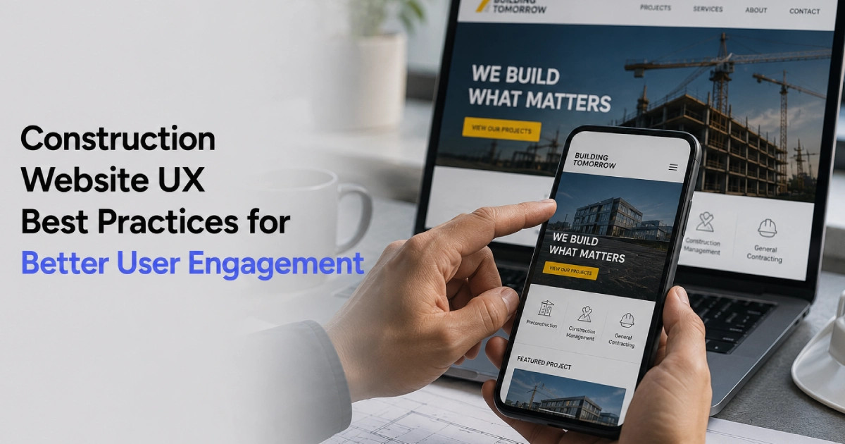
Construction Website UX Best Practices for Better User Engagement
A construction company’s website has an important job. It needs to present services, demonstrate project experience, communicate credibility, and help potential clients take the next step.
Even strong content can underperform when a site is hard to browse.
User experience, or UX, shapes how easily visitors can move around a site, find information, and understand what a contractor can do. For contractors and builders, good construction website UX can make it easier for visitors to find relevant information and take the next step.
A well-planned site combines clean design with simple menus, useful content, fast loading, and clear contact steps.
Why UX Matters for Construction Websites
Construction websites often serve multiple audiences. These may include commercial property owners, developers, facility managers, architects, general contractors, procurement teams, and prospective employees.
Each visitor arrives with a different goal in mind:
- One person wants to check completed projects.
- Another is looking for a specific service, such as design-build or concrete work.
- Someone else needs an office phone number or a bid form.
Good construction website UX helps every visitor find what they need without extra effort. Understanding what makes a great construction website in 2026 starts with a simple, helpful layout that reduces confusion and makes important information easier to access.
Build a Clear and Logical Website Structure
The start of a strong construction website UX is a layout that makes sense. Visitors should be able to quickly identify where to find services, past work, company information, and contact details.
Keep Primary Navigation Simple
A construction website may have many pages, but that does not mean every page needs to appear in the main navigation. Primary navigation can focus on essential sections such as:
- Services
- Industries
- Projects
- About
- Resources
- Contact
Additional pages can be organized within relevant sections. This keeps navigation manageable while still providing access to detailed information.
Use Descriptive Page Labels
Menu names should tell users exactly what they will see. Simple labels like “Services” and “Projects” work better than vague or clever names. Direct names reduce confusion and help visitors move through the site more efficiently.
Make Important Information Easy to Find
Visitors should not have to click through multiple pages to find essential website features every construction company needs. Key information should be visible and easy to access:
- Specific services offered
- Project types and sectors served
- Service areas and office locations
- Safety records, licenses, and insurance details
- Direct phone numbers and simple quote forms
When this information is easy to find, visitors can evaluate your team more efficiently and move toward an inquiry or consultation.
Create Service Pages Around User Needs
Service pages should answer common client questions rather than just fill space. A prospective client wants to know what you do and whether your team is the right fit for their job and project requirements.
Organize Information in Scannable Sections
Long blocks of text can make important information difficult to find. Break service content into sections covering:
- Short service summaries
- Core capabilities and equipment
- Industries supported
- Step-by-step project processes
- Relevant project photos
- Answers to common questions
- Direct contact buttons
Headings, short paragraphs, bullet points, and visual elements make pages easier to scan.
Explain What Makes the Service Relevant
Avoid generic descriptions that could apply to every construction company. Focus on the specific problems the service solves, the industries it supports, and the experience that makes your company qualified to deliver it.
Investing in professional construction website design services ensures your service offerings are structured clearly for both prospective clients and search engines.
Make Project Portfolios Easy to Explore
Projects are often one of the most important sections of a construction website. Potential clients want to see evidence that the company has experience with projects similar to theirs.
Key Parts of an Effective Project Page
- Job Details: Location, build size, sector, and project scope
- Client Challenges: Site constraints, tight deadlines, permits
- Solutions: Construction methods, materials, and coordination
- Clear Visuals: High-quality photos, including before-and-after images where relevant
Build Useful Case Study Pages
Great construction website UX depends on giving photos real context. Include details like the project location, client type, project size, timeline, and how your team handled specific site challenges.
Add Simple Project Filters
If your company has completed many jobs, add clear filters so visitors can sort by:
- Industry (Commercial, Industrial, Healthcare, Residential)
- Service (General Contracting, Renovation, Site Work)
- Location or Region
This lets clients find relevant proof with fewer clicks.
Prioritize Mobile-Friendly Design
Commercial clients, project managers, and property owners often check websites from their phones while on job sites or traveling.
A mobile-friendly site must provide:
- Pages that adjust automatically to any screen size
- Large, readable text without zooming in
- Menus and buttons that are easy to tap
- Fast loading over cellular networks
- One-tap phone numbers and short mobile forms
Visitors should never have to pinch, zoom, or struggle with tiny links to contact your office. Poor responsiveness can make it harder for visitors to navigate the site and complete important actions, which is one factor discussed in why most construction company websites fail.
Improve Website Speed and Visual Performance
Slow load times can increase friction for visitors. If a page takes too long to open, users may leave and visit another contractor’s site.
Construction sites often slow down because of large photo galleries and drone videos. You can avoid common construction website mistakes and protect your construction website UX by:
- Compressing all image files before uploading
- Using modern image formats like WebP
- Setting images to scale down on mobile screens
- Hosting large videos on external video platforms
- Removing heavy animations and extra code
The goal is to keep photos crisp while maintaining efficient page performance.
Write Content That Is Easy to Scan
Website visitors rarely read entire pages word for word. Most people scan headings, bullet points, images, and buttons to find what they need.
Make your site easy to scan by using:
- Short, two-to-three sentence paragraphs
- Clear section headings
- Bulleted lists for capabilities and features
- Visual callout boxes for important facts
- Plain, everyday words rather than complicated jargon
Use Clear Calls to Action
Every page should guide the visitor toward the next logical step. Good construction website UX ensures visitors can quickly identify how to reach your team.
Common, effective call-to-action buttons include:
- Request a Bid
- Schedule a Consultation
- Talk With Our Team
- View Similar Projects
- Download Capabilities Statement
Match the Button to Visitor Intent
Not every visitor is ready to ask for a full project bid on day one. A visitor reading a basic service guide may want to see relevant projects first. Someone who has viewed completed case studies may be more likely to request a consultation or bid. Using the right buttons at the right time keeps the user moving forward naturally.
Keep Contact Forms Short and Simple
Long forms can discourage visitors from reaching out. Only ask for the information you need for a first conversation.
A clean contact form only needs:
- Name
- Company Name
- Email Address
- Phone Number
- Project Type or Location
- Short message box
Keeping your forms short makes it easy for busy project managers and property owners to send a quick inquiry.
Build Trust Directly Into the Browsing Experience
Good UX goes beyond basic layout. It also gives visitors accessible evidence that your firm is safe, licensed, and dependable.
Show proof of your standards across every major page:
- Client reviews and partner quotes
- State licenses and safety ratings (EMR, or Experience Modification Rate, numbers)
- Industry awards and associations (AGC — Associated General Contractors, ABC — Associated Builders and Contractors)
- High-level project stats (square footage, years in business)
- Photos and short bios of company leadership
Placing these items next to project galleries and service lists can reinforce credibility while visitors evaluate your company.
Link Pages Together Naturally
Internal links help visitors find more useful information without going back to the main menu.
For example:
- A service page should link directly to completed projects using that service.
- A project case study should link to the specific services used on the job.
- Blog posts should link directly to the contact page or relevant service descriptions.
This structure helps visitors discover related information and gives search engines clearer context about how your pages connect.
Conclusion
Focusing on construction website UX makes a builder’s site simpler to browse, easier to understand, and more useful for prospective clients.
The best user experience brings together a clean menu, scannable service pages, detailed project case studies, mobile-friendly layouts, fast loading times, and simple contact forms.
When you remove friction and make information easy to find, your website works as a dependable business tool that supports prospective clients as they research and evaluate your firm. If you are ready to modernize your firm’s digital presence, contact Masthead Technology to discuss a site tailored to your business goals.
Frequently Asked Questions
What is construction website UX?
Construction website UX refers to how easily a visitor can navigate, understand, and use a construction company’s website. It covers navigation, page design, speed, mobile usability, content readability, and contact forms.
Why is the construction website user experience important for getting leads?
A smooth user experience helps potential clients quickly find service details and proof of past projects. When a site is simple to use and fast, it can make it easier for visitors to contact the company or request project information.
What pages should be in a construction website’s main menu?
The primary menu should stay simple and include key sections such as Services, Projects, Industries, About Us, Resources, and Contact.
How can a construction company make its website mobile-friendly?
You can improve mobile usability by using responsive layouts, large tap-friendly buttons, simple menus, short contact forms, compressed images, and clear click-to-call phone numbers.
How do project case studies improve user engagement?
Case studies provide real proof of work. Adding project details, challenges, solutions, and clear photos helps visitors determine whether your company has relevant experience for their project.
How often should a construction firm update its website UX?
Review your website layout and available performance or user-behavior data regularly. If you notice visitors leaving quickly or form submissions dropping, test improvements to your menus, page speed, and contact buttons to keep the site working smoothly.