


How to Style Gravity Forms Checkbox: A Step-by-Step Guide
Gravity Forms is one of the most powerful and flexible form builder plugins for WordPress. It allows you to create complex forms with ease, but when it comes to the default styling, you may want to give the checkboxes a customized look to better match your website’s design. Styling checkboxes can enhance the user experience, making your forms look more professional and cohesive with the rest of your site.
In this guide, we’ll show you how to style Gravity Forms checkboxes using custom CSS. Whether you want to change the checkbox size, color, or add custom icons, this tutorial will help you achieve the desired look for your forms.
Why Style Gravity Forms Checkboxes?
Styling checkboxes allows you to:
- Maintain brand consistency: Ensure that the checkboxes match your site’s color scheme, fonts, and overall design aesthetic.
- Improve user experience: Custom checkboxes are easier to spot and interact with, making it simpler for users to fill out your forms.
- Enhance accessibility: Customizing the size and color of checkboxes can make them more accessible to users with visual impairments or those using different devices.
Let’s dive into how to style the checkboxes in your Gravity Forms.
Step 1: Target the Checkbox Fields Using CSS
Before you can style the checkboxes, you need to know how to target the appropriate elements using CSS selectors. Gravity Forms assigns specific class names to its form fields, including checkboxes.
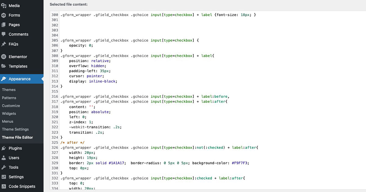
Our Standard CSS for Gravity Forms Checkbox Field:
opacity: 0;}
.gform_wrapper .gfield_checkbox .gchoice input[type=checkbox] + label {
position: relative;
overflow: hidden;
padding-left: 35px;
cursor: pointer;
display: inline-block;}
.gform_wrapper .gfield_checkbox .gchoice input[type=checkbox] + label:before,
.gform_wrapper .gfield_checkbox .gchoice input[type=checkbox] + label:after {
content: '';
position: absolute;
left: 0;
z-index: 1;
-webkit-transition: .2s;
transition: .2s;}
/* after */
.gform_wrapper .gfield_checkbox .gchoice input[type=checkbox]:not(:checked) + label:after {
width: 20px;
height: 19px;
border: 2px solid #1A1A17;
border-radius: 0 5px 0 5px;
background-color: #F9F7F3;
top: 0px;}
.gform_wrapper .gfield_checkbox .gchoice input[type=checkbox]:checked + label:after {
top: 0;
width: 20px;
height: 19px;
border: 2px solid #1A1A17;
background-color: #56D4A4;
z-index: 0; border-radius: 0 5px 0 5px;}
/* before */
.gform_wrapper .gfield_checkbox .gchoice input[type=checkbox]:checked + label:before {
left: 1px;
width: 8px;
height: 16px;
border-top: 2px solid transparent;
border-left: 2px solid transparent;
border-right: 3px solid #fff;
border-bottom: 3px solid #fff;
-webkit-transform: rotateZ(34deg);
transform: rotateZ(34deg);
-webkit-transform-origin: 100% 100%;
transform-origin: 100% 100%;}
.gform_wrapper.gravity-theme .gfield_checkbox label {
line-height: 1.4;}
This selector targets the checkbox input fields within your Gravity Forms.
Where to Add the CSS:
You can add custom CSS to your WordPress site in the following places:
- WordPress Customizer: Go to Appearance > Customize > Additional CSS.
- Theme Stylesheet: Edit the
style.cssfile in your theme or child theme. - Custom CSS Plugin: If you want to avoid editing theme files, you can use a plugin like Simple Custom CSS to manage your custom styles.
Step 2: Test Your Checkbox Styling
Once you’ve added your custom CSS, make sure to test the styling across different browsers and devices. Check that the checkboxes look consistent and function properly on desktops, tablets, and smartphones. You can also use responsive preview in the WordPress Customizer to see how the form appears on various screen sizes.
Conclusion
Styling Gravity Forms checkboxes with custom CSS is a great way to enhance the look and functionality of your forms, ensuring that they align with your brand and provide a better user experience. Whether you want to change the size, color, or even add custom icons, the techniques covered in this guide will help you achieve the desired look for your forms.
At Masthead Technology, we specialize in creating custom WordPress solutions, including form designs using Gravity Forms. If you need help with advanced form styling or customization, feel free to reach out—we’re here to help!
For more information on styling Gravity Forms, see our posts on How to Style Gravity Forms Submit Button and How to Style Gravity Forms Radio Buttons.
FAQs
1. Can I style Gravity Forms checkboxes without coding?
While Gravity Forms provides some built-in styling options, for advanced customizations like changing checkbox colors or icons, you’ll need to use custom CSS.
2. Will the custom checkbox styles work on mobile devices?
Yes, by using responsive CSS and testing your changes across devices, you can ensure that the custom-styled checkboxes work on all screen sizes, including mobile.
3. How can I target specific checkboxes in Gravity Forms?
To style specific checkboxes, you can target them by their field ID. For example, .gform_wrapper #field_1_1 input[type="checkbox"] will only style the checkbox in the form field with the ID 1_1.
4. Can I use images instead of checkboxes?
Yes, you can use CSS to replace the checkbox background with an image or icon. However, it’s recommended to test carefully to ensure usability across different browsers and devices.
5. Do custom checkbox styles affect form performance?
No, adding custom CSS for checkbox styling should not significantly impact form performance. However, be mindful of keeping your CSS clean and efficient to maintain optimal loading times.