


How to Style Gravity Forms Submit Button: A Step-by-Step Guide
Gravity Forms is one of the most popular and powerful form builder plugins for WordPress. It allows you to create advanced forms for contact, registration, surveys, and more with ease. While Gravity Forms provides a great user experience right out of the box, you may want to customize the look of the submit button to match your website’s design.
In this blog post, we’ll guide you through the process of styling the Gravity Forms submit button using custom CSS. Whether you want to change the color, size, or hover effects, this step-by-step guide will help you enhance your form’s appearance and create a more cohesive, branded experience for your website visitors.
Why Style the Gravity Forms Submit Button?
Styling the submit button is essential for several reasons:
- Brand Consistency: A custom-styled button helps your form match the overall design and branding of your website.
- Improved User Experience: A well-designed submit button can improve the form’s usability, making it more appealing for users to complete.
- Call-to-Action Focus: The submit button is the final action point of your form. By making it stand out, you encourage users to take the desired action (e.g., submit their contact information or sign up for a newsletter).
Let’s dive into the different ways you can style the Gravity Forms submit button.
Step 1: Target the Submit Button Using CSS
Before you can style the submit button, you need to know how to target it using CSS selectors. Gravity Forms assigns specific class names to the form and its elements, making it easy to identify the submit button in the CSS.
Our Standard CSS for Gravity Forms Submit Buttons:
.gform_wrapper input[type="submit"] {background-color: #000 !important;
color: #fff !important;
padding: 14px 34px !important;
border: 0 !important;
font-size: 18px !important;
text-decoration: none !important;
border-radius: 30px !important;
display: inline-block !important;
margin-top: 14px !important;
transition: all .2s ease-in-out !important;
box-shadow: 2px 2px 6px rgba(0, 0, 0, 0.3);
}
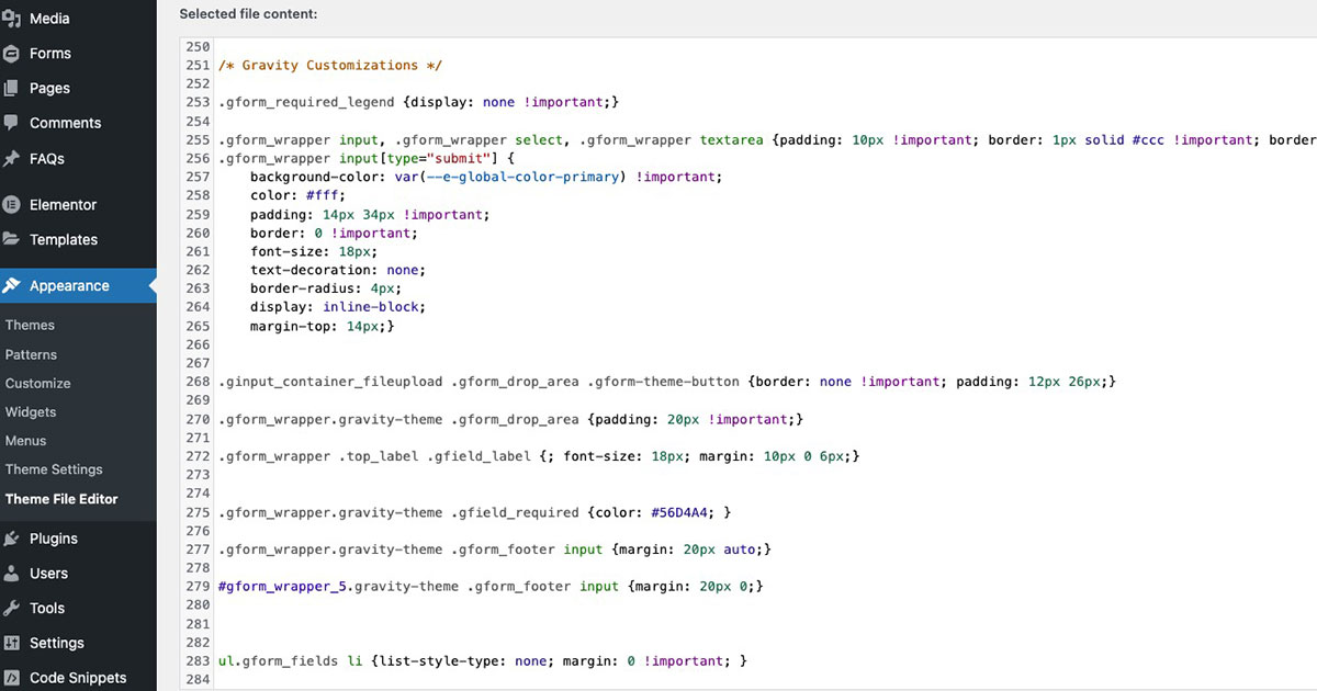
This is the main CSS class used for the submit button on a Gravity Form. By applying styles to .gform_wrapper input[type="submit"], you can change the appearance of the button across your forms. If you want to target the button on a button from a specific form, you can target using the form ID like #gform_wrapper_1 input[type="submit"]
Where to Add CSS:
You can add custom CSS to your WordPress site in the following places:
- WordPress Customizer: Go to Appearance > Customize > Additional CSS.
- Theme Stylesheet: Edit the
style.cssfile in your theme (or child theme). - Custom CSS Plugin: If you prefer not to edit theme files, you can use a plugin like Simple Custom CSS to add your styles.
Step 2: Change Button Color and Background
One of the most common customizations is changing the color of the submit button. You can easily adjust both the text color and the background color using the following CSS:
CSS to Change Submit Button Color:
background-color: #000 !important; /* Background color */
color: #fff !important; /* Text color */
border: 0 !important; /* Remove default border */}
In this example:
- background-color: Sets the button’s background to a black (#000).
- color: Changes the text color to white (#ffffff).
- border: Removes the default button border for a cleaner look.
You can adjust the color codes to match your brand’s palette.
Step 3: Style Button Hover Effects
To make your submit button more interactive, you can add a hover effect. This can improve the user experience by visually indicating that the button is clickable.
CSS to Add Hover Effect:
background-color: #fff !important; /* Background color */
color: #000 !important; /* Text color */
border: 0 !important; /* Remove default border */
box-shadow: 2px 2px 6px rgba(0, 0, 0, 0.5); /* Increase shadow */
}
This CSS swaps the button’s background color and text color when hovered over, and increasing the shadow, giving it a more interactive feel. It is important to note that if you want this hover interaction to happen more smoothly, it is important to add a transition to the original button CSS:
transition: all .2s ease-in-out;
}
Step 4: Adjust Button Size and Padding
If you want your submit button to be larger or smaller, you can adjust its size by changing the padding and font size. This helps ensure the button looks appropriate for different screen sizes and devices.
CSS to Adjust Size:
padding: 14px 34px; /* Adjust padding for button size */
font-size: 18px; /* Adjust font size */
}
In this example:
- padding: Controls the spacing inside the button. Increasing the values will make the button larger.
- font-size: Adjusts the size of the button text. A larger font size makes the button more noticeable.
Step 5: Round Button Corners (Border Radius)
Rounded corners can give your button a more modern and sleek look. This is easily achieved by adjusting the border-radius property in your CSS.
CSS to Add Rounded Corners:
border-radius: 30px !important; /* Round the corners */
}
The higher the value, the more rounded the corners will be. For a completely round button, you can set border-radius to 50px or more.
Step 6: Add Button Shadows for Depth
Adding a box-shadow to your submit button can create a 3D effect, making the button appear more interactive and clickable. Shadows give the button more depth and help it stand out on the page.
CSS to Add Shadow Effect:
box-shadow: 2px 2px 6px rgba(0, 0, 0, 0.3); /* Adds shadow */
}
This shadow effect creates a subtle drop shadow, giving the button a more dynamic appearance. You can adjust the values to make the shadow more pronounced or subtle, depending on the design.
Step 7: Test and Preview Your Changes
After adding your custom CSS, make sure to preview and test your Gravity Forms submit button across different browsers and devices. Ensure that the styling works on both desktop and mobile to provide a seamless experience for all users.
To check how the button looks:
- Use the responsive preview in the WordPress Customizer to see how the button appears on mobile and tablet.
- Test the form in different browsers (Chrome, Safari, Firefox, Edge) to ensure the styles are applied consistently.
Conclusion
Styling the Gravity Forms submit button is a simple yet effective way to enhance the look and feel of your website’s forms. With a few lines of custom CSS, you can match the submit button to your brand’s colors, make it more engaging with hover effects, and improve the user experience with interactive styling.
Whether you want to create a bold, attention-grabbing button or a sleek, minimalist design, the tips outlined in this guide will help you achieve the perfect look for your forms. At Masthead Technology, we specialize in customizing WordPress websites and enhancing user interfaces, so if you need help styling your Gravity Forms or have other design needs, feel free to reach out!
For more information on styling Gravity Forms, see our posts on How to Style Gravity Forms Radio Buttons and How to Style Gravity Forms Checkbox.
FAQs
1. Can I change the submit button style without coding?
Yes, Gravity Forms includes basic styling options in the settings, but for advanced customization, adding custom CSS is the most effective method.
2. Will my styles apply to all Gravity Forms on my site?
Yes, the CSS you apply will generally affect all forms unless you target a specific form using the form ID.
3. Can I make my Gravity Forms button responsive?
Yes, using responsive units like percentages or media queries in your CSS, you can ensure the button looks great on all devices.
4. How do I find the form ID for specific Gravity Forms?
You can find the form ID in the WordPress dashboard under Forms > All Forms. The form ID is displayed next to the form title.
5. Do I need a plugin to add custom CSS to Gravity Forms?
No, you can add custom CSS directly through the WordPress Customizer or theme stylesheets. However, using a plugin like Simple Custom CSS makes it easier for those unfamiliar with theme files.